Visualize Student Performance with ggplot2: Part II
Have you improved?
 Image credit: internet
Introduction
Read Quiz 1 Review if you have not yet done so.
The second Pop Quiz was held around 10pm on Oct 1, 2021. Same as the first quiz, the second quiz consists of ten Multiple Choices Questions which is designed to test your fundamental understanding of the basics of R programming. The Quiz has been automatically graded by the computer and your marks have been published on eLearn. I have some comments on students who got 50% or lower. Please check my comments on eLearn.
This document is to provide you a review of the performance and how you are compared with the first quiz.
Import multiple files in R
I can download your marks from eLearn for each quiz. So now I have two .csv files which contain the marks for each quiz. I can use read.csv() to read each of the files one by one. But imagine you have hundreds and thousands of files which you want to read into one single dataframe. A straight forward algorithm is to use the for loop and read the files through automatic loop. I will use the function list.files() which can list all the files in a specific folder. The rest is a bunch of package:dplyr functions which will merge all files into one single data frame. The loop code is presented as follows^[It is not advised to use df as data frame variable name when you need to check whether the data frame exists or not. The reason is df() is a default function which already exists and exists("df") will always retrun TRUE.].
library(tidyverse)

for (data in list.files(path = ".", pattern = "*.csv", full.names = TRUE)) {

  # Create the first data if no data exist yet
  if (!exists("dataset")) {
    dataset <- read.csv(data, header = TRUE) %>%
      select(Username, FirstName, Score, Out.Of)
    names(dataset) <- c("Username", "Name", "Quiz1", "FullMark")
  }

  # if data already exist, then merge with existing data
  else {
    tempory <- read.csv(data, header = TRUE) %>%
      select(Username, Score)
    names(tempory) <- c("Username", "Quiz2")
    dataset <- left_join(dataset, tempory, by = "Username")
    rm(tempory)
  }
}
As I mentioned in class, for loop in R is not very efficient and we should use alternative vectorized solution if available. The alternative loop is through the function lapply(). I then combine the columns using the function bind_cols()
^[If you need to combine rows, just use bind_rows()]. Kindly note that the following code will work only if all the input files have row to row student id match, otherwise you may mismatch students' marks. So a safer way is to use merge by a common key.
df <- list.files(path = ".", pattern = "*.csv", full.names = TRUE) %>%
  lapply(read.csv) %>%
  bind_cols() %>%
  select(Username...2, FirstName...3, Score...4, Out.Of...5, Score...13) %>%
  rename(Username = Username...2, Name = FirstName...3, Quiz1 = Score...4,
         Quiz2 = Score...13, FullMark = Out.Of...5)
So are the two data frames the same? The answer is TRUE.
identical(df, dataset)
## [1] TRUE
Summary Statistics of Quiz 2
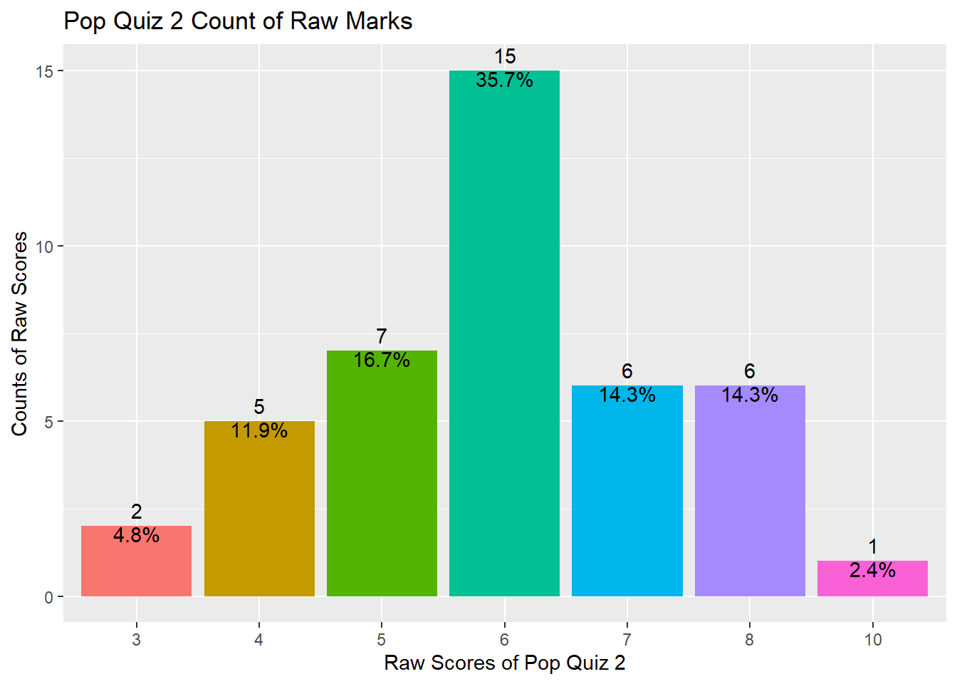
And here is the summary statistics of your Quiz 2 using the summary() function^[summary() provides summary statistics on the columns of the data frame].
summary(df$Quiz2)
##    Min. 1st Qu.  Median    Mean 3rd Qu.    Max.
##   3.000   5.000   6.000   5.976   7.000  10.000
As shown above, your marks range from 3 to 10 with a median value of 6 and a mean value of 5.976, indicating that half of you got 6 marks and above and the distribution is slightly left skewed.
The distribution can also be shown using the following plot.
library(tidyverse)
df %>% ggplot(aes(x = factor(Quiz2), fill = factor(Quiz2))) +
  geom_bar() +
  geom_text(aes(label = ..count..), stat = "count", vjust = -0.5) +
  geom_text(aes(label = scales::percent(x= ..prop..), group = 1),
            stat = "count", vjust = 1) +
  theme(legend.position = "none") +
  ggtitle("Pop Quiz 2 Count of Raw Marks") +
  xlab("Raw Scores of Pop Quiz 2") +
  ylab("Counts of Raw Scores")
So, do you have a better understanding of your performance compared with your peers?
Have you improved?
You can compare your two quizzes' scores directly and see whether you have improved. Here I am trying to do some statistical testing and also provide some visualizations on your performance compared with Quiz 1.
Data transpose from wide to long
I first need to transpose the data from wide format to long format. This can be done easily using the function pivot_longer()^[For long to wide format, use pivot_wider()].
df_long <- df %>%
  pivot_longer(c("Quiz1", "Quiz2"), names_to = "Quiz", values_to = "Score")
Density plot
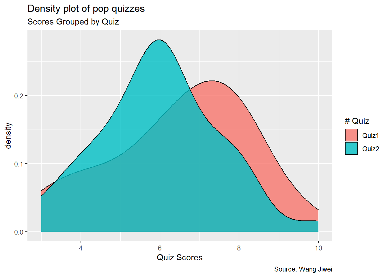
Then I plot a simple density plot for both quizzes^[Note this is slighly different from what I plotted in Quiz 1 Review]. As you can see from the plot below, the distribution of Quiz 2 shifts a little bit to the left, indicating the average performance in Quiz 2 is lower than that in Quiz 1.
df_long %>%
  ggplot(aes(Score)) +
  geom_density(aes(fill = factor(Quiz)), alpha = 0.8) +
  labs(title = "Density plot of pop quizzes",
       subtitle = "Scores Grouped by Quiz",
       caption = "Source: Wang Jiwei",
       x = "Quiz Scores",
       fill = "# Quiz")
Summary statistics
This is evidenced by the following summary statistics of the two quizzes.
df_mean <- df_long %>%
  group_by(Quiz) %>%
  summarize(count = n(),
            mean_score = mean(Score),
            sd = sd(Score)) %>%
  ungroup()
As you can see, the average score of Quiz 2 is 5.976, which is lower than the Quiz 1 average of 6.524. But the standard deviation of Quiz 2 is lower than the standard deviation of Quiz 1.
Frequency count plot by Quiz
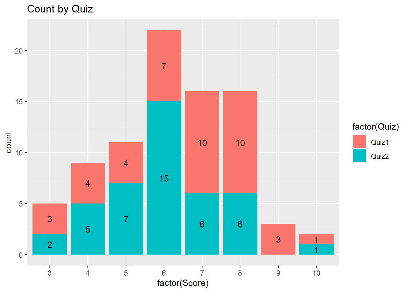
The following plot provides the frequency count by quiz. Compared with Quiz 1, more students got 6 marks and fewer students got 7 and 8 marks in Quiz 2.
df_long %>% ggplot(aes(x = factor(Score), fill = factor(Quiz)))+
  geom_bar() +
  geom_text(aes(label = ..count..),
            stat = "count",
            position = position_stack(vjust = 0.5)) +
  ggtitle("Count by Quiz")
Pyramid plot
The following presents the pyramid plot by quiz. To make the plot, I first need to make a data frame which contains Count (number of students) for each Quiz and Score (ie, without duplicated Quiz and Score. In the plot, the X will be Score, Y will be Count and the fill is Quiz. In addition, I need to make one group (Quiz) of Count as negative (then it will be plotted at the opposite side to the other group). When I flip the axes over, it will show on two sides. The code is as follows.
df_pyram <- df_long %>%
  group_by(Quiz, Score) %>%
  summarize(Count = n()) %>%
  right_join(df_long) %>%
  group_by(Quiz, Score) %>% # have to group_by again as right_join will invalidate the group_by
  slice(1) %>%
  ungroup()

df_pyram$Count <- ifelse(df_pyram$Quiz == "Quiz1", -1 * df_pyram$Count, df_pyram$Count)
library(ggthemes)

brks <- seq(-20, 20, 5)
lbls = paste0(as.character(c(seq(20, 0, -5), seq(5, 20, 5))))

df_pyram %>%
  ggplot(aes(x = factor(Score), y = Count, fill = factor(Quiz))) +
  geom_bar(stat = "identity", width = .6) +
  scale_y_continuous(breaks = brks,
                     labels = lbls) +
  coord_flip() +
  labs(title = "Pop Quiz Scores",
       y = "Number of Students",
       x = "Scores",
       fill = "# Quiz") +
  theme_tufte() +
  theme(plot.title = element_text(hjust = .5),
        axis.ticks = element_blank()) + # Centre plot title
  scale_fill_brewer(palette = "Dark2")
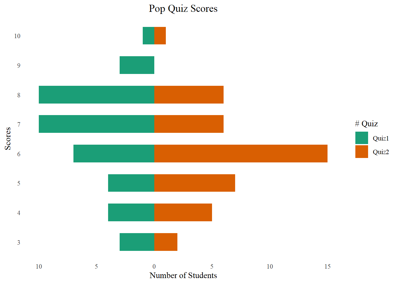
The plot is not a really pyramid shape. If your data has increasing or decreasing trend for different groups, it will be more like a pyramid.

Connect two paired points
I am trying to plot the changes of scores by connecting dots for each student (Username).
df_long %>%
  ggplot(aes(x = Quiz, y = Score, fill = Quiz)) +
  geom_boxplot() +
  geom_point()+
  geom_line(aes(group = Username, colour = Username), arrow = arrow(), linetype = 1) +
  theme(legend.position = "none") +
  ggtitle("Score Movement from Quiz 1 to Quiz 2")
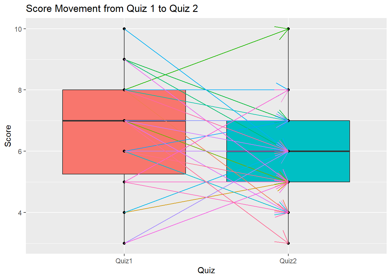
The above plot shows a very interesting observation. It seems students who scored lower in Quiz 1 tend to get higher marks in Quiz 2. All students who got 3 marks and 4 marks have improved in Quiz 2, as shown by the up trend of the arrows. On the other hand, students who performed well in Quiz 1 tend to get lower marks in Quiz 2. All the students who got 10 marks and 9 marks in Quiz 1 have lower scores in Quiz 2. Does it mean the first quiz motivated some students to study more but also made some students tang ping? It seems we need to have a third pop quiz to make everyone improve.
The above plot also shows a box plot which is a very popular plot for data exploratory and outlier detecction. We will discuss more in a future topic. You may refer here to learn more.
Two samples t-test
Now I try the t-test as follows.
t.test(Score ~ Quiz, data = df_long)
##
## 	Welch Two Sample t-test
##
## data:  Score by Quiz
## t = 1.534, df = 79.674, p-value = 0.129
## alternative hypothesis: true difference in means between group Quiz1 and group Quiz2 is not equal to 0
## 95 percent confidence interval:
##  -0.1628543  1.2580924
## sample estimates:
## mean in group Quiz1 mean in group Quiz2
##             6.52381             5.97619
As you can see, the t-statistic is 1.534 and its corresponding p-value is 0.129, indicating that the average performance of Quiz 1 and Quiz 2 is not significantly different.
Conclusion
This document shows the review of your performance in the second Pop Quiz in the Programming with Data course for the Master of Professional Accounting programme at Singapore Management University. You should be able to know your performance compared with your peers. You also understand whether there is a performance improvement in Quiz 2 compared with Quiz 1. In addition, I also review some fundamental data & analytics skills using R programming, including extract, transform and load (ETL) data, t-test, and data visualizations. I hope you will find this document useful.
If you are interested in plotting using package:ggplot2, here is a great summary.
You want to know more? Make an appointment with me at calendar.
Wang Jiwei
Associate Professor
My current research/teaching interests include digital transformation and data analytics in accounting.