Full time vs. Part time, which performs better academically?
How are you compared with your peers?
 Image credit: stevosdisposable
Welcome
The intention of this post is not to provide a rigorous answer to the question in the title. It aims to demonstrate how to solve a problem using data analytics with R programming. Specifically, it helps to deliver the following learning objective:
able to use hypotheses and business analytics to solve sophisticated problems in an unstructured environment.
The data used in this post is from a recent pop quiz in the Master of Science in Accounting (Data & Analytics) program at the Singapore Management University.
Summary Statistics
Here is the original file I downloaded from course website eLearn. It contains 42 rows and 9 columns, which can be shown by the dim() function as follows. dim() shows the dimensions of the data frame by row and column. It indicates that there are 42 students who have attempted the Quiz.
df <- read.csv("popquiz1.csv")
dim(df)
## [1] 42 9
So what are the nine columns prepared by eLearn? We can use the str() function. str() shows the structure of the data frame. Note that the function by default will show the first 4 values of each column. As some are confidential information, I have set the vec.len argument to 0 which will not display any values.
str(df, vec.len = 0)
## 'data.frame':	42 obs. of  9 variables:
##  $ Org.Defined.ID          : int  NULL ...
##  $ Username                : chr   ...
##  $ FirstName               : chr   ...
##  $ LastName                : chr   ...
##  $ Score                   : int  NULL ...
##  $ Out.Of                  : int  NULL ...
##  $ X.                      : chr   ...
##  $ Class.Average           : chr   ...
##  $ Class.Standard.Deviation: chr   ...

Alternatively, you may mask some columns by removing them from the dataframe. Note that you have to use number index of columns if you want to use - to remove columns. You cannot use the name of columns. You may try str(df[, -c("Score")]) and it will not work.
str(df[, -c(1:4, 6)])
## 'data.frame':	42 obs. of  4 variables:
##  $ Score                   : int  10 9 7 10 8 9 6 6 9 9 ...
##  $ X.                      : chr  "100%" "90%" "70%" "100%" ...
##  $ Class.Average           : chr  "75.71%" "75.71%" "75.71%" "75.71%" ...
##  $ Class.Standard.Deviation: chr  "20.02%" "20.02%" "20.02%" "20.02%" ...
And here is the summary statistics of your Scores using the summary() function. summary() provides summary statistics on the columns of the data frame.
summary(df$Score)
##    Min. 1st Qu.  Median    Mean 3rd Qu.    Max.
##   2.000   7.000   8.000   7.619   9.000  10.000
As shown above, your marks range from 2 to 10 with a median value of 8 and a mean value of 7.619, indicating that half of you got 8 marks and above and the distribution is slightly left skewed. Besides the above three functions, you may also try colnames(), head(), tail(), and View() to explore your data frame.
The distribution can also be shown using the following plot.
library(tidyverse)
df %>% ggplot(aes(x = factor(Score), fill = factor(Score))) +
  geom_bar() +
  geom_text(aes(label = ..count..), stat = "count", vjust = -0.5) +
  geom_text(aes(label = scales::percent(x= ..prop..), group = 1),
            stat = "count", vjust = 1) +
  theme(legend.position = "none") +
  ggtitle("Pop Quiz 1 Count of Raw Marks") +
  xlab("Raw Scores of Pop Quiz 1") +
  ylab("Counts of Raw Scores")
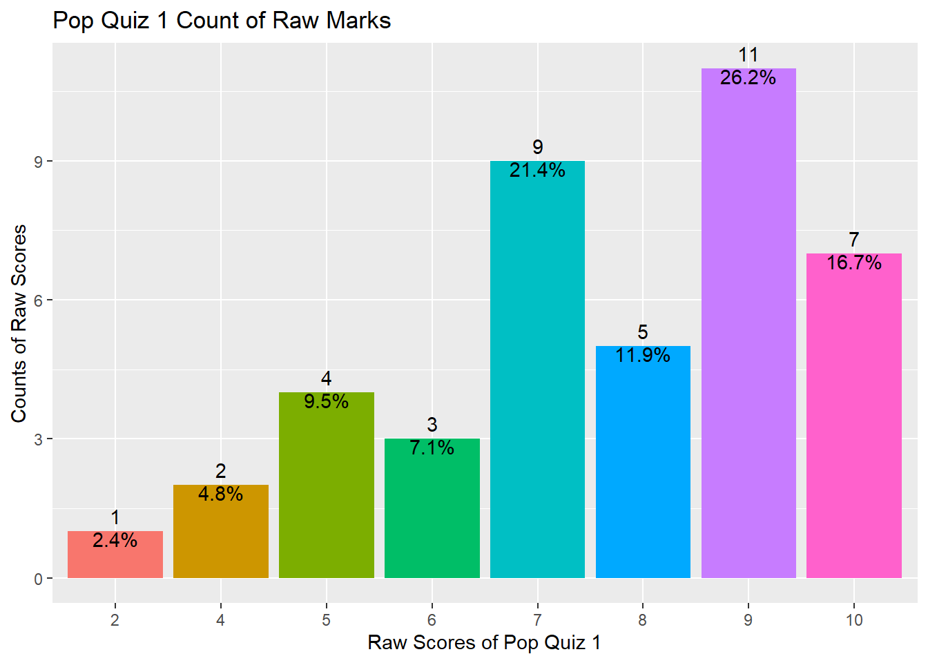
If you don’t input the y = argument in the aes() function under ggplot(), it will automatically plot the x by counts (ie, number of observations for each value of x). This is called the frequency plot.
The above plot also shows you how to fill up color for bars, how to show number of counts as bar label, how to show percentage of counts as bar label, and how to remove all legends. You may refer to package:ggplot2 manual for more options. Of course the best teacher is always google.
The following plot presents another way to show your scores. It is the cumulative percentile of your scores. For example, if your score is 10, you are the top 100 percentile in the class. If you score is 7, you are right below the top 50% percentile. I am using another package:ggthemes which includes some pre-defined themes. The theme I am using is the Economist magazine theme. Feel free to try.
library(ggthemes)
df %>% ggplot(aes(x = Score)) +
  stat_ecdf() +
  labs(title = "Cumulative Density of Pop Quiz 1 Scores",
       y = "Percentile", x = "Pop Quiz 1 Raw Marks") +
  scale_color_manual(values = c("Green")) +
  theme_economist()
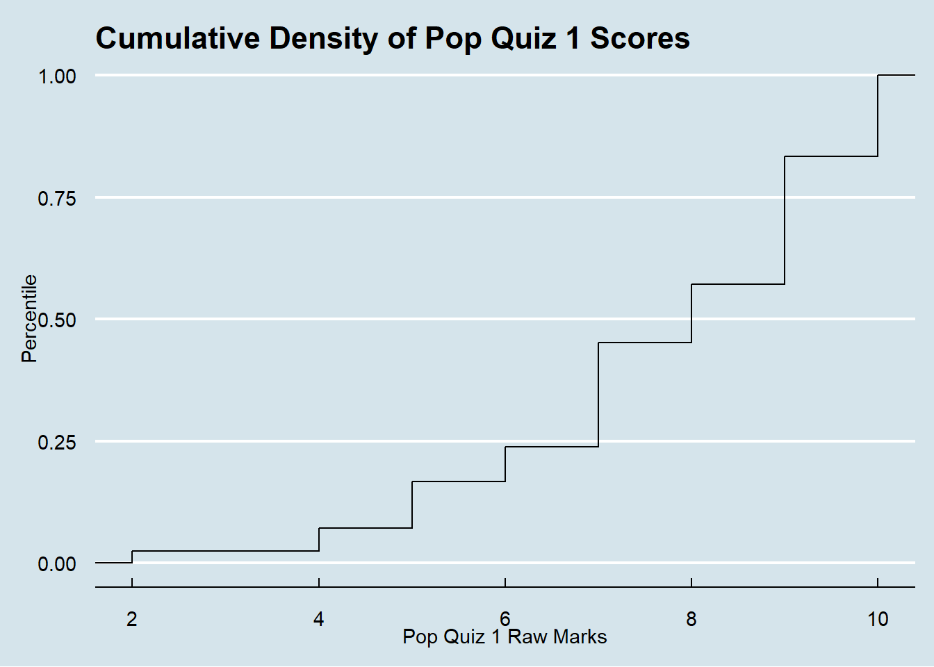
So, do you have a better understanding of your performance compared with your peers?
Hypothesis Testing
One interesting hypothesis I’d like to explore is whether the 2020 intake students (part time) perform better or worse than the 2021 intake students (full time). Why is this interesting? Because I have different arguments which can give us different predictions. This is the essence of an interesting research question, ie, there should be tension between different views.
The 2020 part time intake students may perform better because:
- they are more mature as they are on average older;
- they are more adapted to the SMU teaching style after study
~torture~in the program for one year;
On the other hand, the 2020 part time intake students may perform worse because:
- they already have a nice job and may not be academically driven, hence they have decided to tang ping;
- they are working and may not have enough time for coursework.

So, here is my hypothesis:
- H0: There is no score difference between the 2020 intake and the 2021 intake.
- H1: The 2020 intake students perform differently from the 2021 intake students.
I first need to separate you into two groups according to your enrollment year. It is easy to do as the last four characters of your SMU Username represent your enrollment year.
What we need to do is to extract the last four characters from each Username and assign it to a new variable intake. There are many ways to do this and the easiest is to use the str_sub() from the package:stringr which is also part of the package:tidyverse package. We will cover this in a later topic of the course.
df <- df %>% mutate(intake = str_sub(Username, -4, -1),
                    intake2020 = ifelse(intake == "2020", 1, 0))
Another way is to use the sub() function and the regular expression. Regular expression is important if you want to analyze textual data and we will cover in a later topic. You may teach yourself here. The following code is to replace anything before the . within your Username with nothing, thus the remaining will be the year of your enrollment. There are some other ways to extract or replace substrings in a character vector, such as substr(); substring(); and others.
df <- df %>% mutate(intake = sub(".*\\.", "", Username),
                    intake2020 = ifelse(intake == "2020", 1, 0))
In the above code chunk I also create another variable intake2020 which takes the value of 1 if your enrollment year is 2020 and 0 if your enrollment year is 2021. This is a dummy variable which indicates your intake year. This is a very important concept in data science called one-hot encoding which can help to code categorical variables.
The following code is to summarize the mean scores for the two different and independent groups.
df %>%
  group_by(intake) %>%
  summarize(count = n(),
            mean_score = mean(Score),
            sd = sd(Score)) %>%
  ungroup()
## # A tibble: 2 x 4
##   intake count mean_score    sd
##   <chr>  <int>      <dbl> <dbl>
## 1 2020       7       8.29  1.11
## 2 2021      35       7.49  2.08
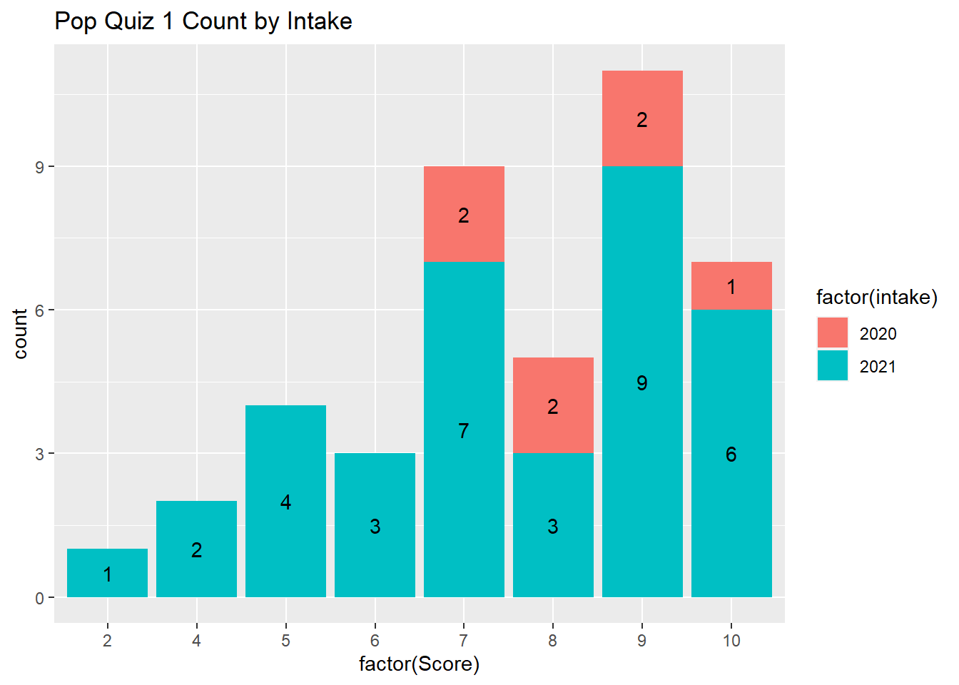
As you can see, there are 7 students from the 2020 intake and 35 students from the 2021 intake. It seems the intake 2020 students have a higher average score than the 2021 intake students. And the standard deviation for the 2020 intake is also lower than that of the 2021 students.
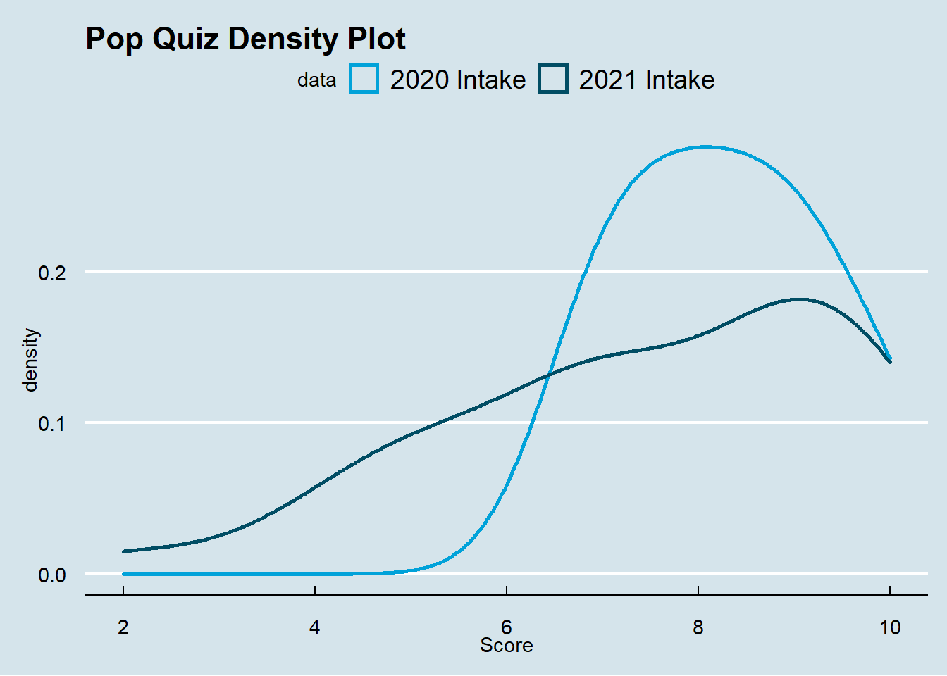
I am presenting you two plots to further visualize the performance of the two different groups.
The following plot provides the frequency count by intake year.
df %>% ggplot(aes(x = factor(Score), fill = factor(intake)))+
  geom_bar() +
  geom_text(aes(label = ..count..),
            stat = "count",
            position = position_stack(vjust = 0.5)) +
  ggtitle("Pop Quiz 1 Count by Intake")
The following plot presents the density by intake year.
df %>% ggplot(aes(x = Score, color = as.factor(intake))) +
  geom_density(size = 1) +
  ggtitle("Pop Quiz Density Plot") +
  scale_color_economist(name = "data",
                        labels = c("2020 Intake", "2021 Intake")) +
  theme_economist()
So, shall we reject our null hypothesis and conclude that the 2020 intake students perform differently from the 2021 intake students in the Pop Quiz 1? As a frequentist, we need to construct statistics to test whether these two groups perform differently.
Two Independent Samples T-Test
We first try the standard t-test for two independent samples. It is reasonable to assume the two groups are independent as we recruit students independently every year.
The t.test() function is from the Base R and the syntax is very simple. This is a fundamental test which is applied very often in business. For example, in the A/B test by Microsoft. It is basically a comparison of two independent groups.
t.test(Score ~ intake2020, data = df)
##
## 	Welch Two Sample t-test
##
## data:  Score by intake2020
## t = -1.4601, df = 15.917, p-value = 0.1637
## alternative hypothesis: true difference in means between group 0 and group 1 is not equal to 0
## 95 percent confidence interval:
##  -1.9619659  0.3619659
## sample estimates:
## mean in group 0 mean in group 1
##        7.485714        8.285714
As you can see, the t-statistic is -1.4601456 and its corresponding p-value is 0.1637059. As we are doing two-sided test and 0.05 is a confident significance level, we can conclude that we failed to reject the null hypothesis, ie, we failed to find any significant performance difference between 2020 intake and 2021 intake.
Regression Analysis
We may also perform regression analysis as follows.
model1 <- lm(Score ~ intake2020, df)
summary(model1)
##
## Call:
## lm(formula = Score ~ intake2020, data = df)
##
## Residuals:
##     Min      1Q  Median      3Q     Max
## -5.4857 -1.2857  0.1143  1.5143  2.5143
##
## Coefficients:
##             Estimate Std. Error t value Pr(>|t|)
## (Intercept)   7.4857     0.3318  22.558   <2e-16 ***
## intake2020    0.8000     0.8129   0.984    0.331
## ---
## Signif. codes:  0 '***' 0.001 '**' 0.01 '*' 0.05 '.' 0.1 ' ' 1
##
## Residual standard error: 1.963 on 40 degrees of freedom
## Multiple R-squared:  0.02364,	Adjusted R-squared:  -0.000766
## F-statistic: 0.9686 on 1 and 40 DF,  p-value: 0.3309
The above regression result shows that the estimated coefficient on intake2020 is positive but insignificant. The t-value is 0.984 and its p-value is 0.331. As the p-value is larger than 0.05, we conclude that we failed to reject the null hypothesis, ie, we failed to find that the two groups of students perform differently.
In summary, I conclude that there is no significant difference in performance between the 2020 part time students and the 2021 full time students.
A caveat of the above analysis is that we failed to control for other factors which may also affect your performance in the first quiz. Due to data availability, I am not able to go beyond this. So please interpret the results with caution.
Conclusion
This document shows the review of your performance in the first Pop Quiz in the Forecasting and Forensic Analytics course for the Master of Science in Accounting (Data & Analytics) program at Singapore Management University. You should be able to know your performance compared with your peers. You also have some understanding of the performance in two different intake students. In addition, we also review some fundamental data & analytics skills using R programming, including extract, transform and load (ETL) data, hypothesis testing, and data visualizations. I hope you will find this document useful.
You want to know more? Make an appointment with me at calendly.
Are you ready for the next pop quiz?
Wang Jiwei
Associate Professor
My current research/teaching interests include digital transformation and data analytics in accounting.