Have you improved?
Visualize student performance using ggplot2
 Image credit: **Photo by Navi on Unsplash **
Introduction
The objective of this post is to visualize student performance in three pop quizzes in my Forecasting and Forensic Analytics course at the Singapore Management University. It will cover the following R techniques:
- reading multiple files using R with
forloop orlapply() - summary statistics for multiple variables using
summarize()andpivot_longer() - reshape data with multiple observations per row using
pivot_longer() - data visualizations with
package:ggplot2- frequency plot
- density plot
- pyramid plot
- movement plot
- paired samples t-test
Import multiple files in R
I download the marks from eLearn for each quiz. So now I have three .csv files which contain the marks for each quiz. I can use read_csv() to read each of the files one by one. But imagine you have hundreds and thousands of files which you want to read into one single dataframe. A straight forward algorithm is to use the for loop and read the files through automatic loop. I will use the function list.files() which can list all the files in a specific folder. The rest is a bunch of package:dplyr functions which will merge all files into one single data frame. The loop code is presented as follows. It is not advised to use df as data frame variable name when you need to check whether a data frame exists or not. The reason is the exists("df") will always return TRUE. I don’t use the function in the following code though.
library(tidyverse)

i <- 1
dataset <- data.frame()

for (data in list.files(path = ".", pattern = "*.csv", full.names = TRUE)) {

  # Create the first data if the data frame is blank
  if (is.data.frame(dataset) & nrow(dataset) == 0) {
    dataset <- read_csv(data) %>%
      select(Username, FirstName, Score, "Out Of")
    names(dataset) <- c("Username", "Name", paste0("Quiz", i), "FullMark")
  }

  # if data already exist, then merge with existing data
  else {
    i <- i + 1
    tempory <- read_csv(data) %>%
      select(Username, Score)
    names(tempory) <- c("Username", paste0("Quiz", i))
    dataset <- left_join(dataset, tempory, by = "Username")
    rm(tempory)
  }
}
As I mentioned in class, for loop in R is not very efficient and we should use alternative vectorized solution if available. The alternative loop is through the function lapply(). I then combine the columns using the function bind_cols(). If you need to combine rows, just use bind_rows(). Kindly note that the following code will work only if all the input files have row to row student id match, otherwise you may mismatch students' marks. So a safer way is to use merge by a common key.
df <- list.files(path = ".", pattern = "*.csv", full.names = TRUE) %>%
  lapply(read_csv) %>%
  bind_cols() %>%
  select(Username...2, FirstName...3, Score...5, "Out Of...6", Score...14,
         Score...23) %>%
  rename(Username = Username...2, Name = FirstName...3, Quiz1 = Score...5,
         Quiz2 = Score...14, Quiz3 = Score...23, FullMark = "Out Of...6")
So are the two data frames the same? The answer is TRUE.
identical(df, dataset)
## [1] TRUE
Summary Statistics of Quizzes
And here is the summary statistics of the three quizzes using the summary() function. summary() provides summary statistics on the columns of the data frame.
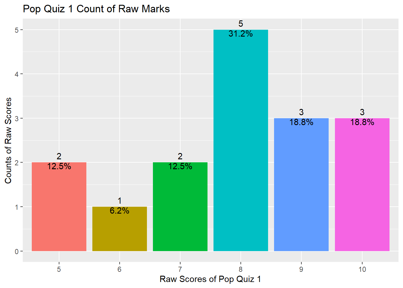
Quiz 1
summary(df$Quiz1)
##    Min. 1st Qu.  Median    Mean 3rd Qu.    Max.
##   5.000   7.000   8.000   7.938   9.000  10.000
As shown above, your marks range from 5 to 10 with a median value of 8 and a mean value of 7.938, indicating that half of you got 8 marks and above and the distribution is slightly left skewed.
The distribution can also be shown using the following plot.
df %>% ggplot(aes(x = factor(Quiz1), fill = factor(Quiz1))) +
  geom_bar() +
  geom_text(aes(label = ..count..), stat = "count", vjust = -0.5) +
  geom_text(aes(label = scales::percent(x= ..prop..), group = 1),
            stat = "count", vjust = 1) +
  theme(legend.position = "none") +
  ggtitle("Pop Quiz 1 Count of Raw Marks") +
  xlab("Raw Scores of Pop Quiz 1") +
  ylab("Counts of Raw Scores")
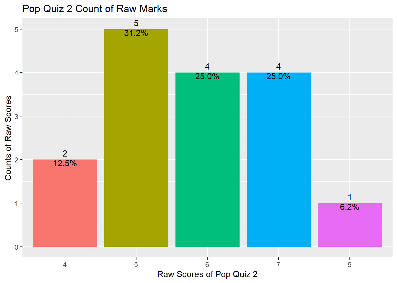
Quiz 2
And here is the summary statistics for Quiz 2.
summary(df$Quiz2)
##    Min. 1st Qu.  Median    Mean 3rd Qu.    Max.
##   4.000   5.000   6.000   5.875   7.000   9.000
As shown above, your marks range from 4 to 9 with a median value of 6 and a mean value of 5.875, indicating that half of you got 6 marks and above and the distribution is slightly left skewed.
The distribution can also be shown using the following plot.
df %>% ggplot(aes(x = factor(Quiz2), fill = factor(Quiz2))) +
  geom_bar() +
  geom_text(aes(label = ..count..), stat = "count", vjust = -0.5) +
  geom_text(aes(label = scales::percent(x= ..prop..), group = 1),
            stat = "count", vjust = 1) +
  theme(legend.position = "none") +
  ggtitle("Pop Quiz 2 Count of Raw Marks") +
  xlab("Raw Scores of Pop Quiz 2") +
  ylab("Counts of Raw Scores")
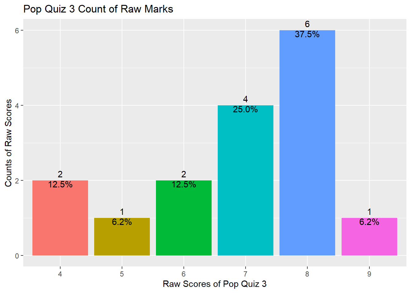
Quiz 3
And here is the summary statistics for Quiz 3.
summary(df$Quiz3)
##    Min. 1st Qu.  Median    Mean 3rd Qu.    Max.
##   4.000   6.000   7.000   6.875   8.000   9.000
As shown above, your marks range from 4 to 9 with a median value of 7 and a mean value of 6.875, indicating that half of you got 7 marks and above and the distribution is slightly left skewed.
The distribution can also be shown using the following plot.
df %>% ggplot(aes(x = factor(Quiz3), fill = factor(Quiz3))) +
  geom_bar() +
  geom_text(aes(label = ..count..), stat = "count", vjust = -0.5) +
  geom_text(aes(label = scales::percent(x= ..prop..), group = 1),
            stat = "count", vjust = 1) +
  theme(legend.position = "none") +
  ggtitle("Pop Quiz 3 Count of Raw Marks") +
  xlab("Raw Scores of Pop Quiz 3") +
  ylab("Counts of Raw Scores")
Summary statistics in a table
It is mundane to present the summary one by one. Why not show them at one go in a table? There are some packages in R which can do so but I will try to use the summarize() function from the package:dplyr.
df_sum <- df %>%
  summarize(across(c("Quiz1", "Quiz2", "Quiz3"),
                   list(min = min,
                        q25 = ~quantile(., 0.25),
                        median = median,
                        q75 = ~quantile(., 0.75),
                        max = max,
                        mean = mean,
                        sd = sd)))
The result from the above code a wide data frame as shown below.
str(df_sum)
## tibble [1 x 21] (S3: tbl_df/tbl/data.frame)
##  $ Quiz1_min   : num 5
##  $ Quiz1_q25   : Named num 7
##   ..- attr(*, "names")= chr "25%"
##  $ Quiz1_median: num 8
##  $ Quiz1_q75   : Named num 9
##   ..- attr(*, "names")= chr "75%"
##  $ Quiz1_max   : num 10
##  $ Quiz1_mean  : num 7.94
##  $ Quiz1_sd    : num 1.61
##  $ Quiz2_min   : num 4
##  $ Quiz2_q25   : Named num 5
##   ..- attr(*, "names")= chr "25%"
##  $ Quiz2_median: num 6
##  $ Quiz2_q75   : Named num 7
##   ..- attr(*, "names")= chr "75%"
##  $ Quiz2_max   : num 9
##  $ Quiz2_mean  : num 5.88
##  $ Quiz2_sd    : num 1.31
##  $ Quiz3_min   : num 4
##  $ Quiz3_q25   : Named num 6
##   ..- attr(*, "names")= chr "25%"
##  $ Quiz3_median: num 7
##  $ Quiz3_q75   : Named num 8
##   ..- attr(*, "names")= chr "75%"
##  $ Quiz3_max   : num 9
##  $ Quiz3_mean  : num 6.88
##  $ Quiz3_sd    : num 1.5
So we need to reshape it using pivot_longer(). Note that the data is different from what we did in class. The data has multiple observations per row and you may check the manual here.
df_sum_tidy <- df_sum %>%
  pivot_longer(everything(),
               names_to = c(".value", "Statistics"),
               names_sep = "_",
               values_drop_na = TRUE)
df_sum_tidy
## # A tibble: 7 x 4
##   Statistics Quiz1 Quiz2 Quiz3
##   <chr>      <dbl> <dbl> <dbl>
## 1 min         5     4     4
## 2 q25         7     5     6
## 3 median      8     6     7
## 4 q75         9     7     8
## 5 max        10     9     9
## 6 mean        7.94  5.88  6.88
## 7 sd          1.61  1.31  1.5
So, do you have a better understanding of your performance compared with your peers?
Have You Improved?
You can compare your two quizzes' scores directly and see whether you have improved. Here I am trying to do some statistical testing and also provide some visualizations on your Quiz 3 performance compared with Quiz 2.
Data transpose from wide to long
I first need to transpose the data from wide format to long format. This can be done easily using the function pivot_longer(). For long to wide format, use pivot_wider().
df_long <- df %>%
  pivot_longer(c("Quiz1", "Quiz2", "Quiz3"),
               names_to = "Quiz", values_to = "Score")
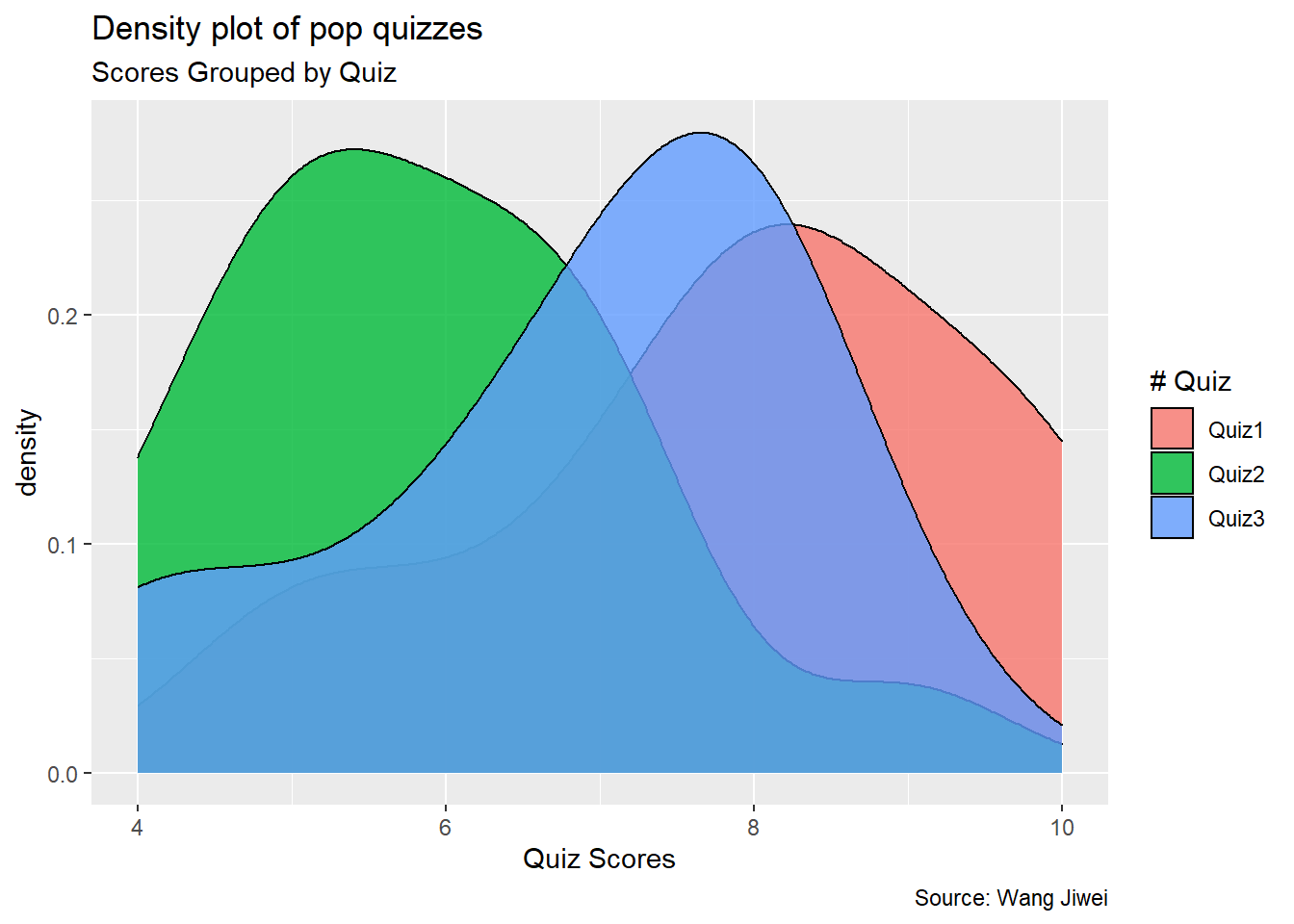
Density plot
Then I plot a simple density plot for both quizzes. As you can see from the plot below, compared with the previous quiz, the distribution of Quiz 2 shifts a little bit to the left and the distribution of Quiz 3 shifts a little bit to the right, indicating the average performance in Quiz 2 is lower than that in Quiz 1 but the Quiz 3 is better than Quiz 2.
df_long %>%
  ggplot(aes(Score)) +
  geom_density(aes(fill = factor(Quiz)), alpha = 0.8) +
  labs(title = "Density plot of pop quizzes",
       subtitle = "Scores Grouped by Quiz",
       caption = "Source: Wang Jiwei",
       x = "Quiz Scores",
       fill = "# Quiz")
Summary statistics
This is evidenced by the following summary statistics of the three quizzes.
df_mean <- df_long %>%
  group_by(Quiz) %>%
  summarize(count = n(),
            mean_score = mean(Score),
            sd = sd(Score)) %>%
  ungroup()
df_mean
## # A tibble: 3 x 4
##   Quiz  count mean_score    sd
##   <chr> <int>      <dbl> <dbl>
## 1 Quiz1    16       7.94  1.61
## 2 Quiz2    16       5.88  1.31
## 3 Quiz3    16       6.88  1.5
As you can see, the average score of Quiz 2 is 5.875, which is lower than the Quiz 1 average of 7.938. But the standard deviation of Quiz 2 is lower than the standard deviation of Quiz 1. In comparison, the average score of Quiz 3 is 6.875, which is higher than the Quiz 2 average of 5.875.
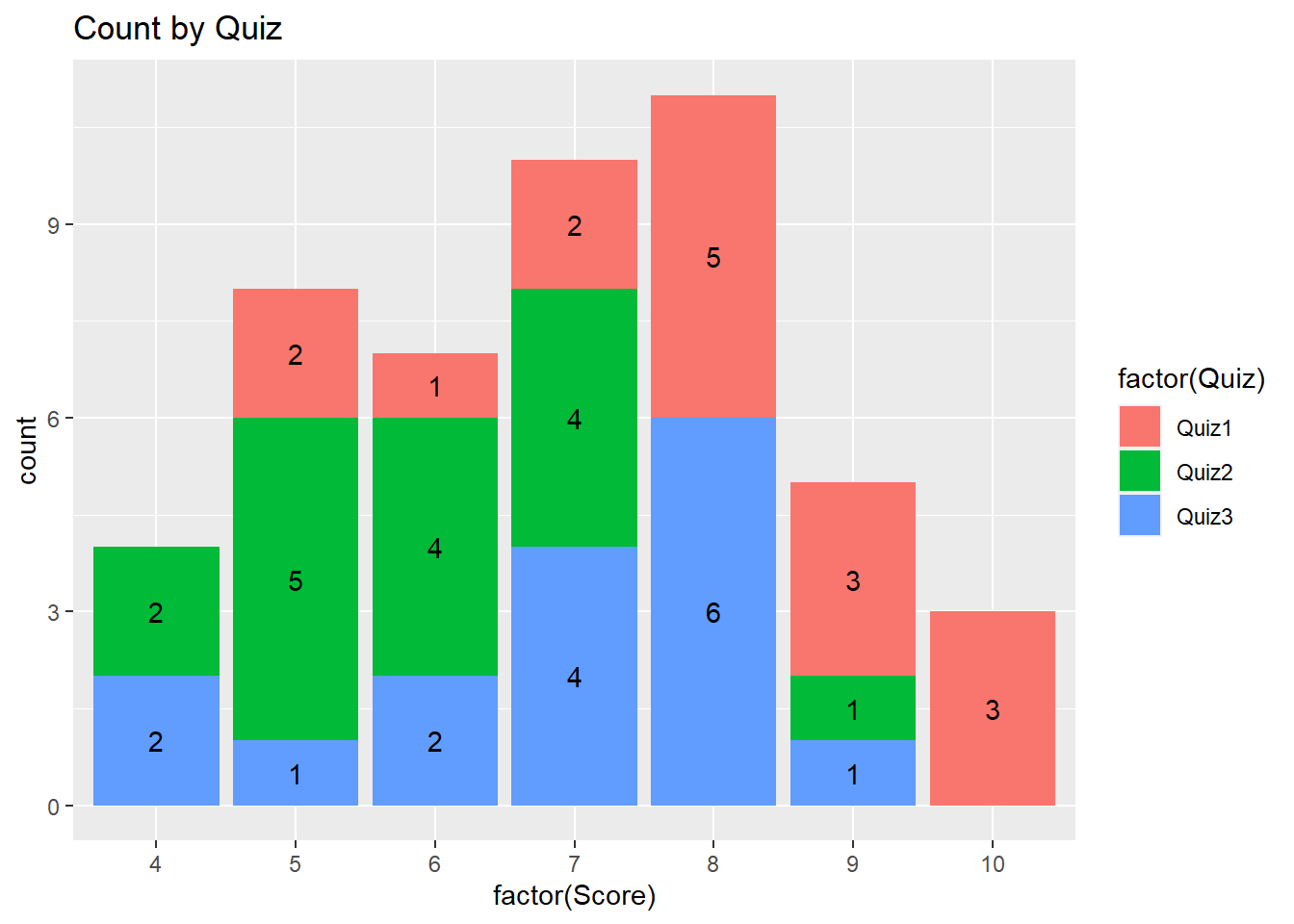
Frequency count plot by Quiz
The following plot provides the frequency count by quiz. Compared with Quiz 1, more students got lower marks in Quiz 2.
df_long %>% ggplot(aes(x = factor(Score), fill = factor(Quiz)))+
  geom_bar() +
  geom_text(aes(label = ..count..),
            stat = "count",
            position = position_stack(vjust = 0.5)) +
  ggtitle("Count by Quiz")
Pyramid plot
The following presents the pyramid plot by quiz. To make the plot, I first need to make a data frame which contains Count (number of students) for each Quiz and Score (ie, without duplicated Quiz and Score). In the plot, the X will be Score, Y will be Count and the fill is Quiz. In addition, I need to make one group (Quiz) of Count as negative (then it will be plotted at the opposite side to the other group). When I flip the axes over, it will show on two sides. The code is as follows.
df_pyram <- df_long %>%
  filter(Quiz != "Quiz1") %>%
  group_by(Quiz, Score) %>%
  summarize(Count = n()) %>%
  right_join(df_long) %>%   # have to group_by again
  group_by(Quiz, Score) %>% # as right_join will invalidate group_by
  slice(1) %>%
  ungroup()

df_pyram$Count <- ifelse(df_pyram$Quiz == "Quiz2",
                         -1 * df_pyram$Count, df_pyram$Count)
library(ggthemes)

brks <- seq(-20, 20, 5)
lbls = paste0(as.character(c(seq(20, 0, -5), seq(5, 20, 5))))

df_pyram %>%
  ggplot(aes(x = factor(Score), y = Count, fill = factor(Quiz))) +
  geom_bar(stat = "identity", width = .6) +
  scale_y_continuous(breaks = brks,
                     labels = lbls) +
  coord_flip() +
  labs(title = "Pop Quiz Scores",
       y = "Number of Students",
       x = "Scores",
       fill = "# Quiz") +
  theme_tufte() +
  theme(plot.title = element_text(hjust = .5),
        axis.ticks = element_blank()) + # Centre plot title
  scale_fill_brewer(palette = "Dark2")
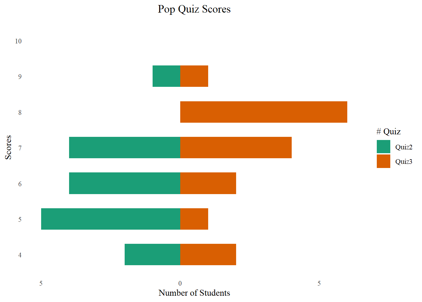
The plot is not a really pyramid shape. If your data has increasing or decreasing trend for different groups, it will be more like a pyramid.

Connect paired points
I am trying to plot the changes of scores by connecting dots for each student (Username).
df_long %>%
  ggplot(aes(x = Quiz, y = Score, fill = Quiz)) +
  geom_boxplot() +
  geom_point()+
  geom_line(aes(group = Username, colour = Username),
            arrow = arrow(), linetype = 1) +
  theme(legend.position = "none") +
  ggtitle("Score Movement from Quiz 1 to Quiz 3")
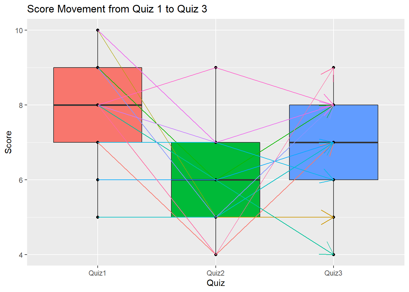
The above plot shows that most students have lower marks in Quiz 2 but then improve in Quiz 3.
The above plot also shows a box plot which is a very popular plot for data exploratory and outlier detection. You may refer here to learn more.
Paired samples t-test
The paired samples t-test is used to compare the means between two related groups of samples. In this case, I want to compare Quiz 2 and Quiz 3 for the same group of students.
paired <- t.test(Score ~ Quiz, data = df_long[df_long$Quiz != "Quiz1", ],
                 paired = TRUE, alternative = "two.sided")
paired
##
## 	Paired t-test
##
## data:  Score by Quiz
## t = -1.9675, df = 15, p-value = 0.0679
## alternative hypothesis: true difference in means is not equal to 0
## 95 percent confidence interval:
##  -2.08334125  0.08334125
## sample estimates:
## mean of the differences
##                      -1
As you can see, the t-statistic is -1.967 and its corresponding p-value is 0.068, indicating that the average performance of Quiz 2 and Quiz 3 is not significantly different.
Multiple sample test
Do you want to compare all the three quizzes with one test? We may compare the means of each quiz and propose the following hypothesis:
- H0: The means of the three quizzes are the same
- H1: The means of the three quizzes are different
For multiple groups comparison, we may use the one-way ANOVA test.
oneway <- aov(Score ~ Quiz, data = df_long)
summary(oneway)
##             Df Sum Sq Mean Sq F value  Pr(>F)
## Quiz         2  34.04  17.021   7.781 0.00125 **
## Residuals   45  98.44   2.187
## ---
## Signif. codes:  0 '***' 0.001 '**' 0.01 '*' 0.05 '.' 0.1 ' ' 1
As the p-value is less than the significance level of 0.05, we can conclude that there are significant differences among the three quizzes. But we don’t know which pairs of quizzes are significantly different from other pairs.
We can perform multiple pairwise-comparison to determine if the mean difference between specific pairs of quiz are statistically significant.
Tukey multiple pairwise-comparisons
As the one-way ANOVA test is significant, we can compute the Tukey Honest Significant Differences using the TukeyHSD().
The function TukeyHD() takes the fitted ANOVA as an argument.
TukeyHSD(oneway)
##   Tukey multiple comparisons of means
##     95% family-wise confidence level
##
## Fit: aov(formula = Score ~ Quiz, data = df_long)
##
## $Quiz
##                diff        lwr        upr     p adj
## Quiz2-Quiz1 -2.0625 -3.3298379 -0.7951621 0.0007966
## Quiz3-Quiz1 -1.0625 -2.3298379  0.2048379 0.1162460
## Quiz3-Quiz2  1.0000 -0.2673379  2.2673379 0.1469125
It compares all the possible pairs among the three quizzes. The p-value of the Quiz2-Quiz1 pair is significantly lower than 1%, thus we can tell the Quiz 2 is significantly lower than Quiz 1.
Conclusion
This document shows the review of your performance in three Pop Quizzes in the Forecasting and Forensic Analytics course at the Singapore Management University. You should be able to know your performance compared with your peers. You also understand whether there is a performance improvement in Quiz 3 compared with Quiz 2. In addition, I also review some fundamental data & analytics skills using R programming, including extract, transform and load (ETL) data, paired samples t-test, and data visualizations. I hope you will find this document useful.
If you are interested in plotting using package:ggplot2, here is a great summary.
You want to know more? Make an appointment with me at calendar.
Wang Jiwei
Associate Professor
My current research/teaching interests include digital transformation and data analytics in accounting.